
In this day and age, practically every individual and institution seems to have some sort of indelible presence on the internet; website homepages, social media profiles, & email contacts have proliferated at exponential rates in the 20th century, and museums, historical societies, & heritage sites have risen to the expectations of digital existence with varying degrees of success. As a child of the late Digital Revolution and a “digital native” (as I am frequently reminded by a Communications professor co-worker whenever I help her troubleshoot issues with her Microsoft Office suite), using the internet is is a vital part of everyday existence for my academic research and my work as a public historian & museum practitioner, as well as my everyday existence as a person with a wifi connection and a weakness for PBS Nature documentaries (incidentally, their Passport streaming service is $5/month).
Based on two decades of lived experience as an internet user (we got our first family desktop computer when I was six, and I will somehow be turning twenty seven this September) my criteria for a “successful” history website do generally align with Daniel J. Cohen and Roy Rosenzweig’s “seven qualities of digital media and networks that potentially allow us to do things better”, particularly their position on digital accessibility. Their assertion that “to those who previously had no easy access, online archives open locked doors” resonates with both my personal praxis and my own body of work as a student and academic. Generally, a successful website takes into account several qualities:
- Ease of access – how do users navigate the site? Is it intuitive to use? Is the user interface too cluttered or so streamlined you can’t find where anything is? Does the mobile version of the site look like garbage? (So many mobile sites feel like they’ve been rolled out without any real beta period)
- Search function – if a user cannot find what they’re looking for based on the site’s navigation menus, are they able to input terms and search for themselves? Does the query function offer relevant results? Is there functionality for advanced searches?
- Good design – It’s 2020. By this point, people should be familiar enough with the internet to at least put a little effort into the aesthetics of website design, especially if you are a professional or official organization, there really aren’t good excuses at this point.
As much as I can speak generally about digital use in the present day, the reality is that – especially for those of us based in the United States – 2020 has forced us online more than ever before. With so many museums & historical institutions either closed (to wait out COVID-19 or for good) or greatly reduced in operating hours, staff, programming, and visitor capacity, the internet is simply the most accessible and effective means for continued existence & outreach. This blog post examines three historical websites – the Massachusetts Historical Society (particularly their Adams Papers resources), Commonplace: the journal of early American life, and the National Parks Service website for the Adams National Historical Park – to highlight some of the ways that history websites shine and fail spectacularly, and sometimes make some frankly baffling design choices.
Massachusetts Historical Society
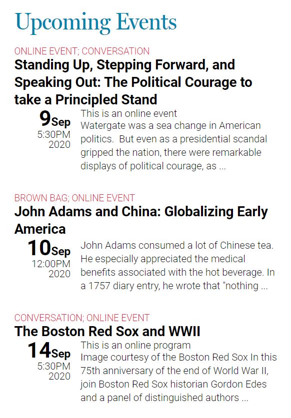
Founded in 1791, the MHS is the oldest historical society in the United States, boasting a collection of over 3,600 manuscript collections, approximately 120,000 photographic images, more than 10,000 broadsides, and thousands of other records & objects. Besides their archival role, they also provide a variety of research & educational resources, offer fellowship opportunities, and produce a variety of programming. When I went to start reviewing the homepage for this assignment, I DID end up registering for an online brown bag on “John Adams and China: Globalizing Early America,” which was a pleasant bonus. Yay programming!
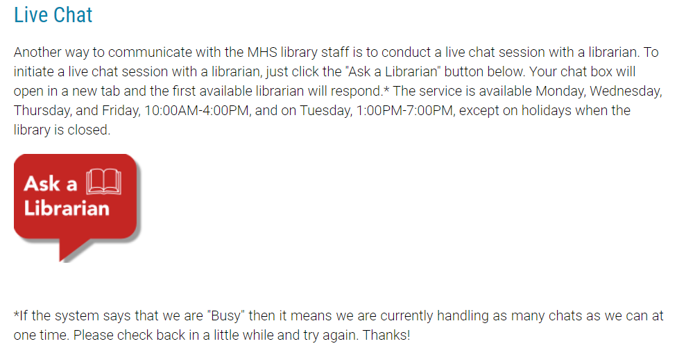
The Good: Out of this immense collection, a large and diverse percentage is available online. I have worked on and off with the MHS holdings – particularly the Adams Papers – since I was a high school student feeling my way through my first “advanced” research paper, and it’s been exciting to see how much the digital offerings have improved in both quantity & quality over the years. One thing I’ve found incredibly helpful has been their “Ask a Librarian” service, which has saved me many times when I have had research & citation questions. The chat function is straightforward to use and unobtrusive; I’ve never had to wait to access the system, and the response time is quite prompt for an institution of their size.
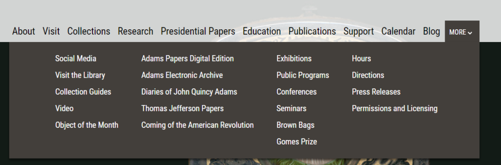
The Bad: Their navigation bar, frankly. All of the main page buttons are – for some reason – static links, with a very messy “More” drop-down menu that feels overwhelming, and most likely incredibly unhelpful if a visitor is looking for something other than the 20 options listed. My preference, since I’m offering a critique, would be for each button to have its own categorized drop-down. That way all of these links, which obviously mattered to the MHS webmaster enough to include them, will still be accessible but not force you to look at them all at the same time.
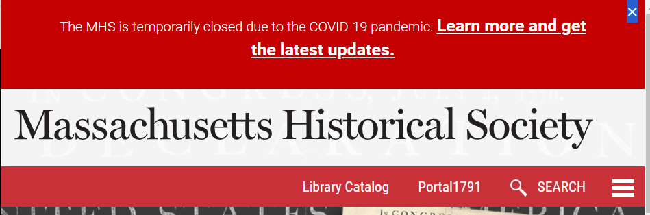
The Ugly: There is a very annoying top banner on every single site page that only disappears from my browser about 10% of the time when I click on the little “X” in the corner! Super great!
Commonplace: the Journal of Early American Life
Jointly published by the American Antiquarian Society and the Omohundro Institute of Early American History & Culture, Commonplace is a (reincarnated) born-digital interdisciplinary resource that functions in part as a scholarly journal, a teaching & learning resource library, and a forum for community engagement. In their own words, Commonplace “speaks—and listens—to scholars, museum curators, teachers, hobbyists, and just about anyone interested in American history before 1900. It is for all sorts of people to read about all sorts of things relating to early American life—from architecture to literature, from politics to parlor manners. It’s a place to find insightful analysis of early American history as it is discussed in scholarly literature, as it manifests on the evening news, as it is curated in museums, big and small; as it is performed in documentary and dramatic films and as it shows up in everyday life.”
The Good: Commonplace is actually the journal’s second iteration (an earlier version was launched in 2000, and the current website rolled out in 2019 with a new partnership between the AAS and the OI), and has been diligently uploading their extensive back-catalog to the site, selecting a topical theme each week and posting relevant articles as well as scholarly reviews and teaching resources to both the site and their social media feeds. I’ve been following them on Twitter since their re-launch, and have been immensely enjoying their weekly preview tweet threads, which go out on Mondays and highlight what will be going live on the site over the next few days. The journal is quite active on social media I think it’s a wonderful initiative not only for its hybrid format and interdisciplinary approach, but also the opportunity for previously-published work – especially by folks outside of the traditional structure of academia. As a collections management junkie, I love all of the object-focused deep dives and the incorporation of cultural studies.
The Bad: I wish they had an index or table of contents feature somewhere! Their site is broken out into 3 main pages: “Teach,” “Learn,” and “Objects,” each of which in turn then brings the visitor to a full-screen tile view of the published content in that section. 10 post tiles load at a time, and you then have to click a “read more” button to load more. It just feels clunky and there is no easy way to see the full section contents captured in one screen – you’re stuck scrolling and scrolling and scrolling…
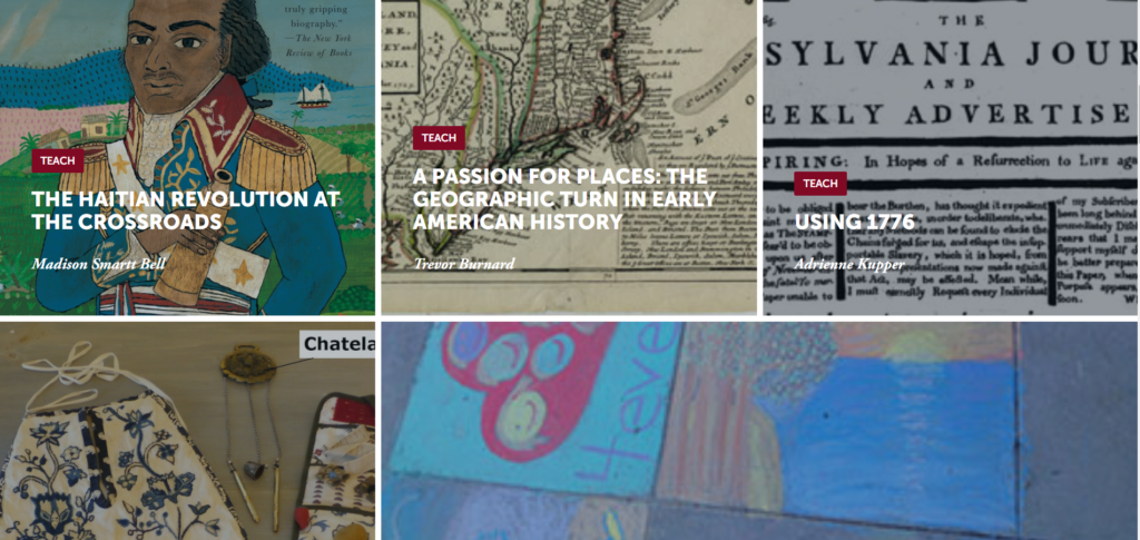
The Ugly: On the posts, images default to these very small thumbnails with way too much negative space on the sides compared to the margins of the text sections. It’s off-balance and you have to click on the images (which redirect you to a new page) to view them!
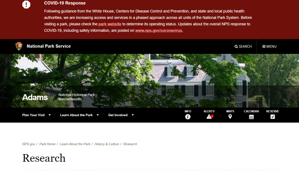
Adams National Historical Park, National Park Service
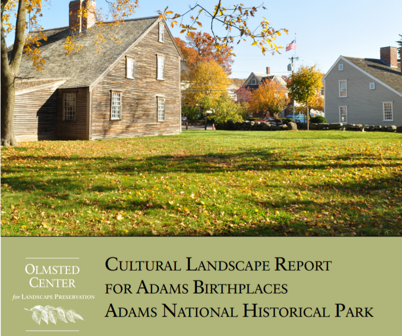
Adams National Historical Park in Quincy, MA (10 miles south of Boston) is a 13 acre site comprised of 3 main properties – the John Adams Birthplace, the John Quincy Adams Birthplace, and Peacefield (aka “the Old House”) – as well as a visitor center from which tour groups depart & return (all via restored streetcar trolley!) after visiting the properties. The digital presence of the Park itself is hosted through the National Park Service’s website, and has been significantly revamped since March’s shutdown of in-person operations.
The Good: The webpage has the 2014 cultural landscape report for the site, which has useful relevant information relating to both the physical sites themselves, as well as plans for NPS stewardship and programming. This would be great except for one thing….
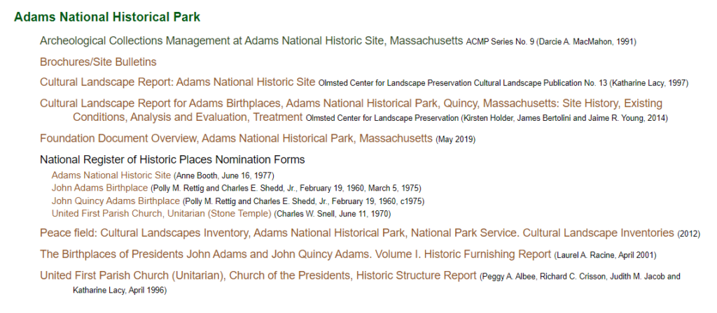
The Bad: In order to find all of the reports and information available for the site, I had to turn to an unaffiliated webpage called the “National Park Service History eLibrary”, which highlights everything that the NPS site doesn’t easily link to. Many of these documents linked on this other site are actually incredibly relevant for the scope of my research, and I’m actually very very very annoyed that they aren’t clearly linked through the official website. Additionally, much of the content on the NPS website is very basic or incomplete information, and is certainly in need of a good round of copy editing.
The Ugly: The NPS website design is just overall bad! Their header text is too small, the COVID-19 banner is static instead of collapsible, the navigational trees are just super sensitive and don’t make sense, or link to essentially-empty pages.
You make a great point about the ability to search a site, and I think this relates back to your point about accessibility. While putting digital history content online makes it immediately more accessible to large groups of people just by its online presence, the content on the site itself is not necessarily easily accessible. I think this also relates to what audience the site is geared towards, but if it is looking to be useful to various users, a word search capability, or other way to easily access different areas of the content (whatever form that would take) seems like a must.
Crispness in font and a real uinderstanding of what is important, or not important, is so critical on a website. Most people will only look for a moment. That “more” page is definitely a mess and easily could have been culled down into a few categories: “diaries,” “programs and conferences,” “planning your visit” etc.
This was a nice first post Lauren. I agree with many of you assessment points. I’ll be honest (and you are not alone in this), but I think I was not clear enough in the assignment. Instead of finding the “good, bad, and the ugly” within one website, I was hoping you would look for three different websites that each personified one of those tags. Let’s put that aside – I think you did a nice job here and the MHS has indeed put a lot of thought into its web presence. You are right to point out the issues with the navigation system and we should (as a class) talk about this – what is the best approach to navigation when you have a site with so much content?
You make a great point about websites sometimes being too streamlined – if it’s so sleek that it takes more than 5-10 seconds to find the menu bar you can lose a lot of users in that timespan.
And I agree with your critique of the menu bar for the Mass Historical site. Many of the pages under “More” could easily be nested under one of the other items such as “Research” or “Collections.”
Overall, however, it’s great that so many items are digitized and available for free. I also love that their collections database is called ABIGAIL 🙂 Since you’ve been using the site since high school, I’m curious about how it has evolved over the years. What are some of the major changes that you noticed?
I like this approach of analyzing sites for all three elements! No DH site is wholly good or bad, there are things that are worth analyzing.
I have had long discussions about what needs to be visible in a top menu for websites. I am usually in favor of dropdown menus but they can become overwhelming, as in your first example. The question, then, is how do we design menu structures so that concepts and groups are discoverable but don’t overwhelm visitors. I have no clear answer, as every site is different, but I do like to think about it!